The 18 Hottest Web Design Trends of 2022 (With Stunning Examples)
Web Design & Development
In today’s fast-paced digital world, having a strong online presence is not an option but a necessity for any business. And as all of us know, a great online presence starts with a well-designed website that is capable to grab, engage, and sell. In fact, the first impression users form of a website is 94% design-related and 75% of users judge the credibility of your business based on your website’s overall aesthetics.
Hence, whether you’re a web designer who wants to deliver users the most contemporary experience or a business owner planning to launch or revamp their website, keeping yourself up with what’s hot and trending right now in the web design sphere becomes imperative for you to stay ahead of the competition.
With that in mind, we have researched and put together some of the latest and hottest web design trends that you can implement in your upcoming projects to make your websites look fresh and stand out from the crowd.
Let’s get acquainted with them, one by one!
#1: Vibrant, Eye-Catching Colors and Gradients
Colors are an integral part of web design and according to a recent study performed by the University of Loyola, Color increases brand recognition by up to 80%. While soft tone and monotone have been a prominent web design trend for a while, more and more users nowadays are craving high contrast, vibrant colors that have a sky-high saturation level. Some reasons why companies now more than ever are using bold bright colors are:
- They improve readability and make your website easier to understand.
- They make your site more visually appealing, ensuring your users would stay on the site for longer.
- As a general rule, the longer a user stays on your site, the more likely they are to convert.
Moreover, ever since Apple and Instagram started to use Gradients in their branding, colorful gradients have become more of a standard than a trend in the web design world.
Examples: Sikkema, Whimsical, Jaszczuk
#2: Vintage Typography/More Serifs
Brands for a long while have been using serifs for print and sans serifs for the screen. However, this year, web designers have gone back to basics, shifting from the modern and thinner looking fonts like sans serifs to softer and rounder old-school typography styles such as serifs which offer a more vintage and relaxed feel.
One of the biggest contributing factors to the adoption of this web design trend is the availability of better screen resolutions across all devices. There was a time when Sans Serifs were the most readable on screens, but thanks to the advent of high-definition, high-resolution screens; using Serifs on your website is no longer an issue.
Examples: MailChimp, The New Yorker, Reform Collective
#3: Dark Mode
According to a recent study, 55% of American generation Z’ers (13-18-year-olds) and 47% of generation Y’ers (19-29-year-olds) surf the Web almost every night for at least one hour before they fall asleep. Means, millions of people are already suffering from eye strain caused by bright backgrounds and blue light emitted from their screens as they often browse the Internet in their dark bedroom.
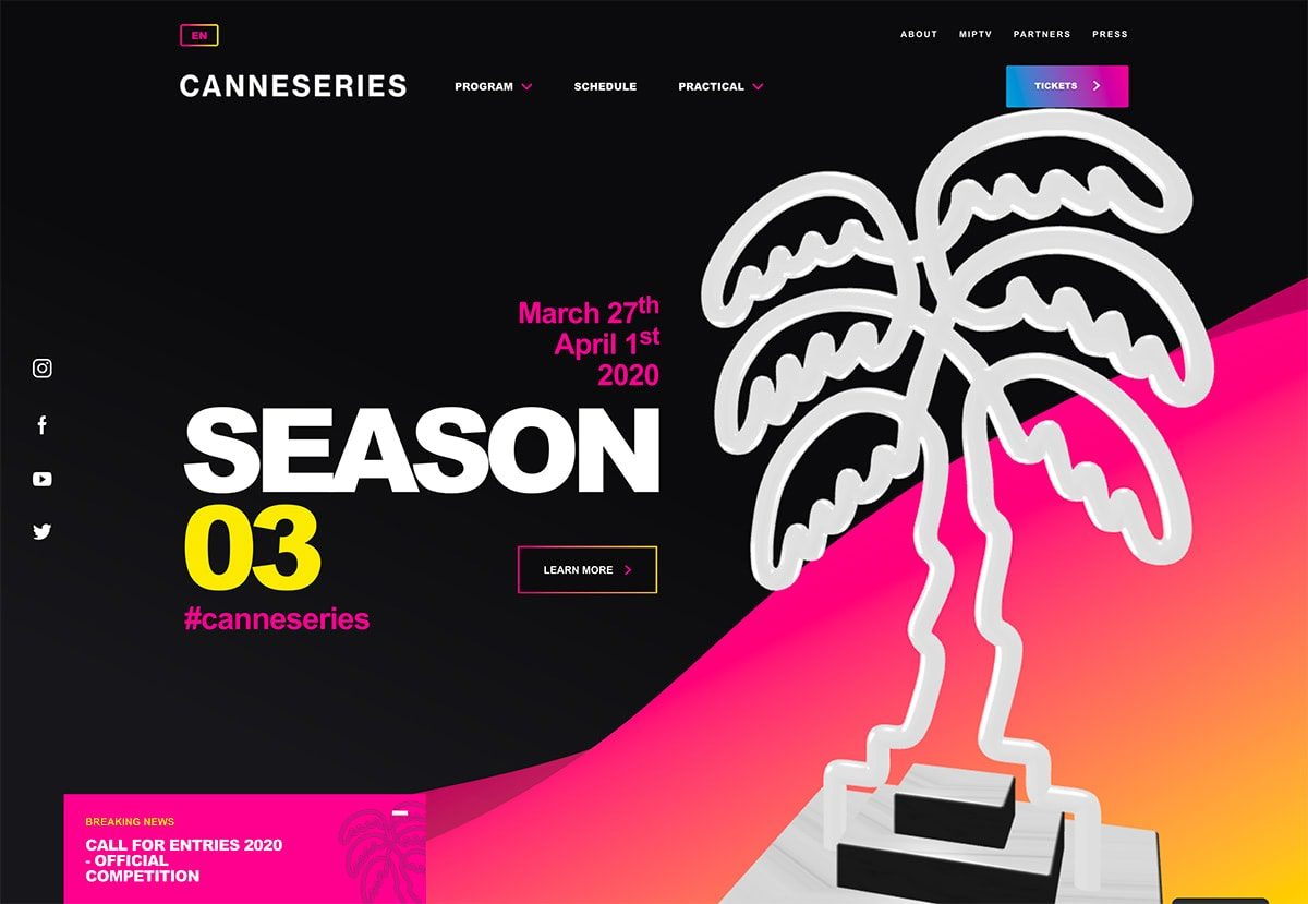
Image Credit: DesignModo.Com
With this problem in mind, web designers and UX professionals are now giving users an option to switch between light and dark modes. Initially implemented in text editors as a way to reduce eye strain and conserve the power of devices, the trend got even steeper when Google incorporated it in many of its apps, from YouTube to Chrome. While the dark mode is a relatively new web design trend, it’s quite popular and likely to be adopted even more widely in 2022.
Examples: Reddit, YouTube, Twitter, Cannes Series
#4: Micro-interactions
Micro-interactions are small animated interactions with one purpose: to create surprise and anxiety to the users through subtle visual effects so that they get compelled to take a specific action on a website. According to many user experience experts, they play a vital role in improving the usability and driving user engagement on a website.
Although Micro-interactions has been around for a long time, they are now being reinvented in a completely new manner. Unlike previously, where Micro-interactions were being used on clickable elements such as buttons and icons, they now come in form of more interactive incarnations such as scrolling animations, hover effects, chimes, and more – making your website feel alive, smarter, and fun to engage with.
Examples: Femme & Fierce, Montreux Jazz Festival, Affinity
#5: Voice User Interfaces (VUIs)
This web design trend is prevalent in 2022 as users these days are looking for the easiest ways to access content online. Reducing the time and effort involved in the interaction, Voice-command interfaces, or conversational devices like Amazon Echo and Google Home makes accessing web content significantly easier and quicker for the end-users.
If you’re a smartphone user, then you’re probably already familiar with voice-enabled search assistants such as Google Assistant, Siri, and Cortana. However, if you’re a professional web designer, you should start thinking about bringing voice search functionality to the user interface of your website or application.
A recent report shows that nearly 65% of 25 to 49-year-olds speak to voice-enabled devices and assistants at least once per day. With a continuously growing number of voice-controlled devices and with more people than ever embracing Voice over Text, the way we interact with brands and how we navigate the Web is rapidly changing.
Where the famous Gartner report predicts that at least 30% of web browsing sessions will be conducted without a screen, on the other hand, ComScore estimates that over 50% of all searches will be performed by voice. Hence, as a web designer, you must be familiar with how users interact with voice commands and how to prototype a voice interface with keywords and related actions.
Examples: Voice Assistant Siri OSX El Capitan, and Dropbox Files in Active UI
#6: Custom Graphic Design and Illustrations
A powerful illustration with bold colors speaks volume and is more versatile than an ordinary image. Even, statistics also say that the visual effect of a custom made illustration on the users is 7 times better than that of any stock photography.
With that said, more and more businesses today are looking forward to incorporating modern-looking illustration into their websites to make them even more interesting and lively. A few benefits of custom design and illustrations are:
- They look unique and authentic
- They can quickly portray powerful emotions through a singular voice
- They make abstract and absurd concepts easier to understand
- They make your brand more personal and less corporate
So, if you want to visually differentiate your website or web app from the competition, you should opt for customized web design packed with professional, hand-drawn sketches and illustrations.
Examples: Airtable, Avocode, Hey Influencers
#7: Brutalism and Maximalism
Most of us love simple, sober and elegant websites. But think, what would happen if you visit something rugged or unadorned? No matter what you feel, you would surely never forget that website, right? This is actually what Brutalist Web Design is all about!
Inspired by the poster arts of the 1950s to 1970s, Brutalism in web design is a style that intentionally attempts to look raw and haphazard, reflecting the aesthetic of early internet websites. With bright colors, bold fonts, blue links, and monochromatic Monospace text, Brutalism sometimes also refers to a bare-bones, almost naked HTML site.
Since Brutalism is one of the best ways to distinguish your brand from others, you can leverage this web design trend to create unforgettable experiences while all your competitors are going for a sleek, conventional design.
Examples: Mary Gaudin, Bergen
#8: Thumb-friendly Mobile Navigation
Responsive Web Design (RWD) isn’t a web design trend anymore! Given that there has been a rapid, continuous decline in the usage of 4” or smaller screen devices in past few years, web designers today are going beyond Responsive Design to make their website even more mobile-friendly. To be more specific, web design nowadays revolves around creating websites that are thumb-friendly.
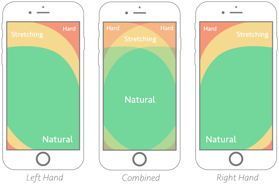
Since most of the users use either their right or left thumb to interact with a mobile responsive website, putting your hamburger menu, navigation bar, and even contact buttons in the Thumb Zone make your site easier to navigate and improve its UX manifold. Wondering what the Thumb Zone is? It is indeed the most comfortable area on mobile touchscreen devices where your thumb can easily reach with one-handed use.
To help you better understand, here is a great graphic from Smashing Magazine showing the thumb-friendly areas of a mobile phone screen:
Examples: Wallet Screen, YONO and Watering Tracker
#9: Mobile-First Web Design
With Google emphasizing mobile-first indexing more than ever, mobile-first web design is the hottest web design trend of 2022. The term ‘mobile-first web design’ simply refers to designing a website or application for mobile devices first, and then design out for devices with larger screen sizes, such as laptops and desktops.
This is opposite to the traditional approach where web designers used to design for large screen devices first and then work down to smaller screens. With so many people using mobile and tablet devices to access the Web, it makes real sense for UI/UX designers to focus more on designing for small screen mobile devices first.
By embracing this new web design trend, you can ensure your website or application will be truly responsive and deliver users the right experience on the right device.
Examples: ABC, Apple, Airbnb, MTV
#10: Emotion in the Design
The ultimate goal of your website or web app is to establish a real connection with your users and that’s what Emotional Design is all about. In 2022, there has been a rapid rise in the emergence of websites that are based on the emotional appeal where every design element of the website provides a cue to users about how they should react. According to web design experts, emotional connections can be divided into four basic categories:
- Joy and Sadness
- Fear and Anger
- Trust and Disgust
- Surprise and Anxiety
So, ideally, to incorporate emotions into your website design, your choice of colors, text, and imagery must portray any of the above groups of feelings. Otherwise, your site may fail to captivate, engage, and retain users.
Examples: Dice Berlin, Sproutsend, and Emotional Designs by Gleb Kuznetsov
#11: Design for Privacy, Safety, and Transparency
Even though Privacy is a fundamental human right, it is still one of the most confusing and least understood topics of the Internet. However, with the introduction of several privacy laws such as GDPR and CCPA in recent years, designing a website or web app with users’ privacy, safety and transparency in mind has now become more vital than ever.
Especially when Google recently was fined a record $57 million by the French data regulator CNIL for lack of GDPR compliance, designing for privacy becomes even more crucial for both legal and economic aspects. So, as a web designer, it’s your responsibility to ensure that your design is privacy-aware and doesn’t violate any data privacy regulation.
Examples: Wrike, Atlassian and Disney
#12: A Strong Emphasis on Accessibility
Web Accessibility, the practice of ensuring that websites and applications are accessible and usable by people with different disabilities, has long been an integral part of web design strategy in mature organizations.
However, with high-profile cases like the pizza-chain Domino’s lawsuit and others struggling through the courts, it’s now more crucial than ever to ensure your website or application is accessible to everyone and anyone.
Moreover, with 26% of adults in the United States having some form of disability, creating accessible websites and applications is a web design trend well worth paying close attention to.
Examples: Deque, Nomensa, Parramatta Park
#13: Design Systems
In the simplest terms, a Design System is a collection of reusable elements guided by a set of design rules and standards. In recent years, these systems have climbed in popularity with more and more companies leveraging them to make their brands scalable and cohesive.
Regardless of the type of web design, Design Systems today are the foundation for everything related to design. When implemented well, they not only reduce inconsistencies in design but also speed up the design process by facilitating communication between developers and designers.
Some popular companies that have developed game-changing Design Systems are Shopify, Trello and Salesforce.
#14: Artificial Intelligence & Contextual Technology
Artificial Intelligence (AI) is one of the technologies that has significantly impacted a wide range of industries, and web design is no exception. You can use AI in web design in two ways:
- Artificial Design Intelligence to automate different aspects of web design, such as via Chatbots.
- As a Contextual Technology to make your websites and applications feel more ‘human-like’ so that they can deliver more targeted and personalized experiences to users.
Either way, you can leverage the potential of this newcomer web design trend to enhance your web design work in 2022 and beyond.
Examples: Amazon, Netflix, ELSA, Scoop.it
#15: More Depth and Almost Real-like Design Elements
Although VR (Virtual Reality) is still in its infant stage, its influence on web design can be seen evidently. To make their designs look more realistic and lively, web designers these days adding more depth to their designs as well as using a variety of other design elements which eventually tends to bring out a more natural feel to their projects.
This includes everything from three-dimensional elements to illustrations to moving shapes to anything that users can virtually feel. In fact, the mash-up of real-like 3D design elements Flat interfaces is leading to the re-evolution of Flat Design, aka Deep Flat or 3D Flat Design.
Examples: BCdesign, Ringba and Stripe
#16: Augmented & Virtual Reality
Augmented Reality (AR) and Virtual Reality (VR) technologies are here for a long while; their impact can now be easily seen in web design and development landscape. The use cases for these technologies are primarily in eCommerce websites as stores and brands alike are implementing AR and VR into their websites to allow them to virtually try out different products, such as clothes, jewelry, makeup, furniture, paint, etc.
IKEA, for instance, already has these technologies in the form of an app, called Ikea Place, which allows users to place furniture around their house via a smartphone camera, to preview what they would look like.
Video: https://www.youtube.com/watch?v=UudV1VdFtuQ
Likewise, there are several companies selling glasses, such as Specsavers and Lenskart, which allow you to try them virtually before you buy them.

Image Credit: SiteJet.io
However, this is just the beginning, and the best is yet to come!
#17: More Focus on Data Visualization
You have some complex data, but how would you show it to your visitors in a simple, fun way? Data visualization is probably the only web design trend that can help you do this. Allowing you to effectively present complex information in a completely distinct manner, this innovative web design technique makes your data easier to understand and more interesting for your users.
To make Data Visualization work most effectively, you can easily turn your complex data into a visually compelling story, where users are taken through the beginning, middle, and the end to the story. Depending on the platform and the intended purpose of your website or web app, you can use Visualized data in the form of scrolling panels, an animation, a still image, or an interactive game.
Examples: Zef Cherry, TasteAtlas and Wind Map
#18: Ultra-minimalist Navigation
Next on the list of web design trends 2022 is ultra-minimalist navigation, which refers to the end of mega menus and emphasizes keeping the navigation hidden by default. With the help of hidden navigation, not only can you save a lot of space in your design, but it also can make your design look less cluttered.
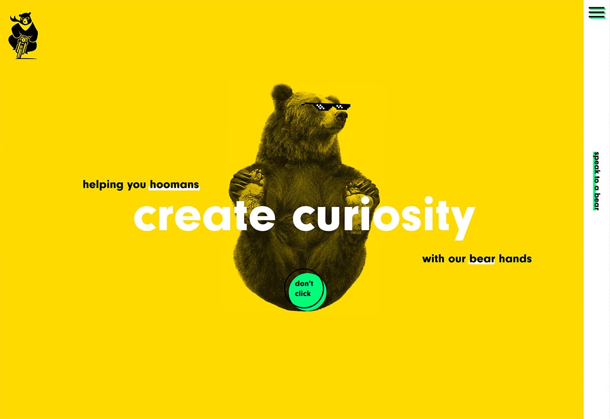
Image Credit: DesignModo.Com
The idea behind streamlined navigation is that users who come to your website via organic search are less likely to start on the homepage. Additionally, extremely minimalist navigation creates a more direct path to the area of the site where you want your visitors to interact most with your design. As a general rule, the less a user thinks about moving around, the more time they are likely to spend immersed in the website. So, consider incorporating this web design trend in your designs.
Examples: Bikebear, Uniel, Masi Tupungato
