iPraxa Redesign: A Quick Tour of Newly Redesigned Website

Web Design & Development
If you’ve been a regular visitor to iPraxa, you might have noticed that things are looking quite different around here. That’s right! After months of hard work and dedication, and to celebrate 13+ years in business, we have finally pressed the ‘refresh’ button and revamped our website with an entirely new look and feel using the latest technologies. The main goal of redesigning the website is to deliver both our existing and potential clients a better, cleaner and faster user experience – making it easy for them to find exactly what they’re looking for.
Why Change?
It has been around three years since our last big redesign and since then, and a lot has changed on the web with the evolution of game-changing technologies like SaaS, Angular, Cloud Computing, etc. Since we love experimenting with new technologies and the latest trends, it was always our intention to redesign our website to better cater to the needs of our clients. So we decided a website facelift and the result is a better and more user-friendly iPraxa.
Being a top-notch mobile and web development company, we lead the industry by example, believe in pushing boundaries and showcase our best work for all old and new clients to come and browse. However, our website re-design goes way beyond that. We revamped our website because we wanted to:
- Improve the look and feel of our website for you, our valued clients
- Showcase our work and services in the best way possible
- Immensely improve the user journey
But we did it, especially, because we felt you deserved it!
The Key Changes At a Glance
With a careful planning and thoughtful design, we’ve tried to make the website feel more modern, dynamic and straightforward. Below are the highlights from the new design:
A Simple, Clean Homepage:
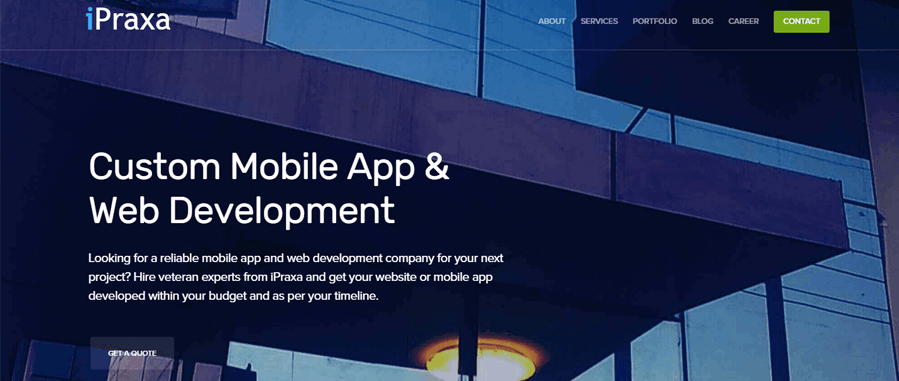
Since the homepage is one of the most visited pages on any website, we focused heavily on the design of the main page. With a simplified layout and an attractive design that strongly resonates with our business, the new home page gives you a clear picture of who we are, what we do, whom we serve and technologies we specialize in.

Improved and Simplified Navigation:
It was indeed the perfect opportunity to improved our website’s navigation system. Using the Google Analytics effectively efficiently, we organized pages according to users’ taste and removed unwanted pages. Now with our new navigation structure that has been redesigned for clarity, simplicity, and usability, you’re only a few clicks away from what you need.
Get Familiar with our Team:
We’ve added profiles for all our designers, developers, quality testers and mobility experts, including their photos and areas of expertise. This will not only help you get acquainted with our Team but also give will you a better idea of who will be working on your project.

New Services:
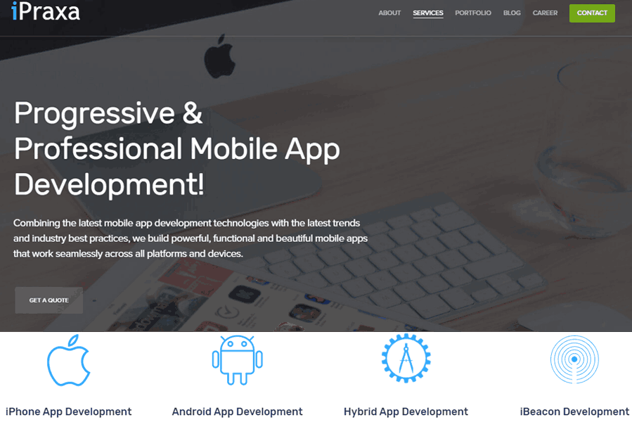
The new website not only offers a fresh, clean and modern design but also has been expanded to a whole new range of services that were previously not available to clients. After conquering the areas of Web Design and Development and Frontend Development and developing several wildly popular and successful Apps for our existing clientele, due to the augmenting demand of mobile apps, our Mobile App Development Services are now open to all clients across the globe.

Mobile App Development Services we currently offer includes but are not limited to iOS/Android/Hybrid App Development, iBeacon Development, Wearable Development, and Internet of Things (IoT).
Content Enhancements:
Not only the design, we’ve also added significantly more content to the new layout to give you a better and clearer picture of the services we offer.
A Completely Revamped Portfolio:
As mentioned earlier, one of the main objectives of revamping our website was to showcase our work in the best way possible. The new and improved portfolio highlights some of our best projects as well as outlines the values delivered to each client.
Redesigned Blog:
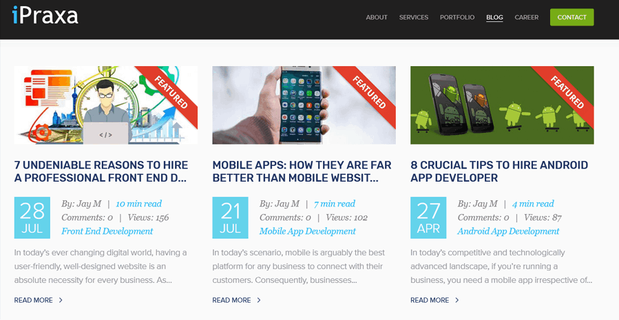
A completely new blog layout to enrich the reading experience for our readers – perhaps you’re already familiar with it since you’re currently reading this post. Be sure to subscribe to our blog so you never miss any updates.

That’s all about the iPraxa new design!
We Love Feedback. Tell Us How We’re Doing.
Since it’s nearly impossible to list each and every change we’ve made to our website, we encourage everyone to visit it and explore all the new and exciting features for yourself. We hope you’ll like all the changes we’ve made to our website to improve the overall user experience. If you have something to say about our new design, feel free to contact us or drop us an email at sales@ipraxa.com.


